

Introducing bright interiors into your living space is relatively easy to do and can have dramatic transformational effects on your quality of life. Take a look at any design portfolio or magazine and you’ll come up with some great hints and tips.
Choosing a colour scheme
The hardest aspect of home design is probably deciding on the right scheme in the first place. Using a colour wheel can help narrow the choices down to a complimentary or analogous scheme.
Read more after the jump:

Complementary schemes
Complimentary colours can be found on opposite sides of the wheel, such as yellow and blue, orange and purple, or green and red. If you’re looking for a clean separation of different colours, more formality and a challenging effect, then this is the scheme to go for.
Analogous schemes
On the wheel, analogous colours are found next to each other, such as blue and violet or orange and red. Choosing analogous colours creates a more restful and casual look for a room, and is especially effective in bedrooms, dens and family rooms.
Back to black
Adding a black touch with a picture frame, lamp shade or other accent will have the effect of enhancing and clarifying neighbouring colours.
Bring on the artwork
Nowadays it’s very easy to introduce some great artwork into the home, whatever your budget. You don’t even have to leave the house, as a brilliant choice of prints, originals and installations is available over the internet, and so the basic question is what sort of art you actually want to be surrounded by.

Local community art
All types of artwork are usually also available out in the local community, from recycled vintage industrial installations to jars, ceramics, mosaics and even portable graffiti. It’s best to begin by choosing a few focal pieces, such as something arresting to frame the couch or a bright canvas to greet visitors in the hallway. Choosing white window shutters, for example, can create a cheerful mood and have the effect of immediately heightening your décor.
Feel free
It’s particularly important to feel free when choosing artwork and a colour scheme for the home. Feel free, for example, to purchase the arty pieces you feel instinctively attracted to and that put a smile on your face, regardless of whether they ‘go with’ anything in the academic sense. If you start with that principle, you can then construct your interior colour scheme and décor around the art rather than trying to do everything ‘right’ at once.
Choose the art and colour scheme that lightens your mood and makes you feel good about yourself and you can’t go far wrong by following your nose.
Summary – bright is beautiful
One of the commonest factors involved in symptoms of weariness and stress is a gloomy home. We perform and respond best on all levels when we’re surrounded by light-inspired interior décor, so it’s important that our homes are as bright and light as we can make them, and that we’re surrounded by beautiful things.
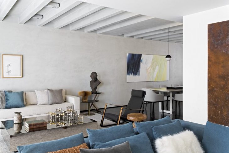
Images from Itaim Apartment by Diego Revollo Arquitetura