
Renjie Teoh designed this inspiring apartment located in Sydney, Australia. Take a look at the complete story below.
Mr Miller’s brief was typical enough: more natural light and improved artificial lighting; make more storage space, free up more usable floor space, overhaul the dated apartment and give it a more “spacious” and uncluttered feel. However, he made this one condition very clear: “please do not go over the top with fancy design”.
The apartment had undergone a minor, partial renovation under the previous owner in the late 1980s that saw the kitchen relocated to its present location, but still retained most lighting, electrical and plumbing services; original fixtures and finishes from the early 1960s when the building was originally constructed. The 80s renovation work was also deteriorating badly by the time I was called in.
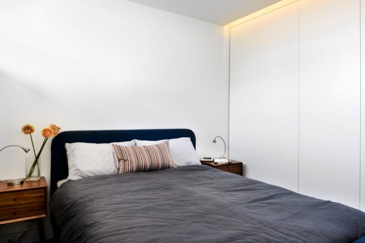
I started by considering the fundamental qualities that make a Home – one that creates a sense of immediate calm and grounding; provides warmth; protects and nurtures the occupant, and yet, leaving enough room for personalisation and ownership. I decided that a pared-back “minimal” spatial approach and a restrained material palette would achieve that sense of calm and uncluttered spaciousness. Yet, there was always this danger that going “minimal” could result in a cold and harsh space; some warmth and “softness” would be needed to strike a balance.
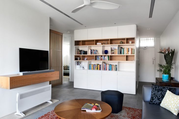
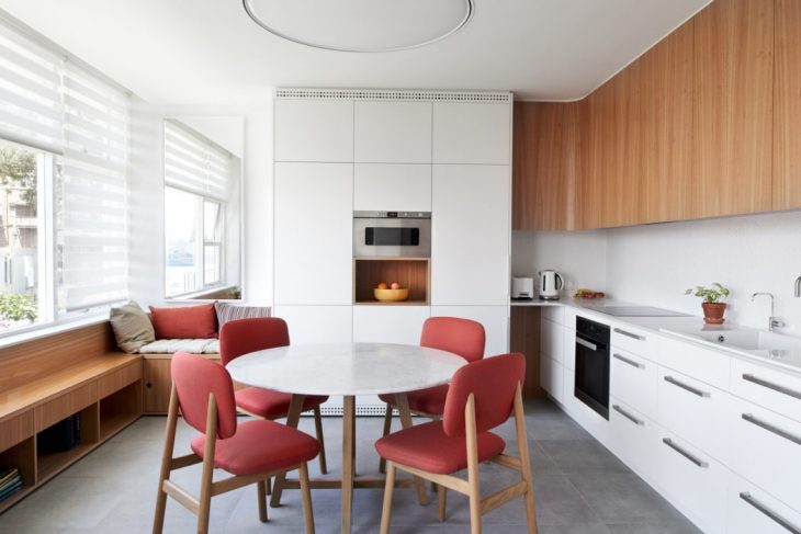
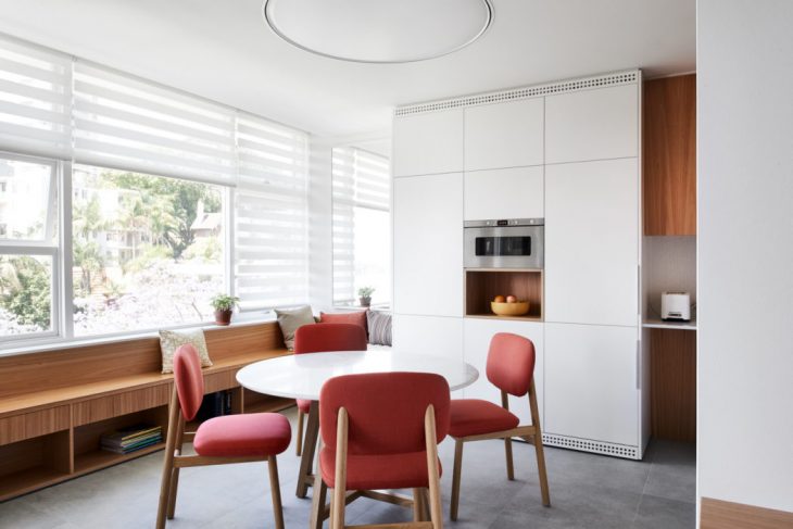
The pared-back, “minimal” spatial design was achieved through the extensive use of joinery work, where storage and utility was hidden away and thus seamlessly integrated into the space.
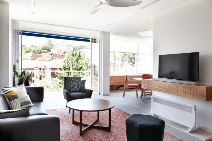
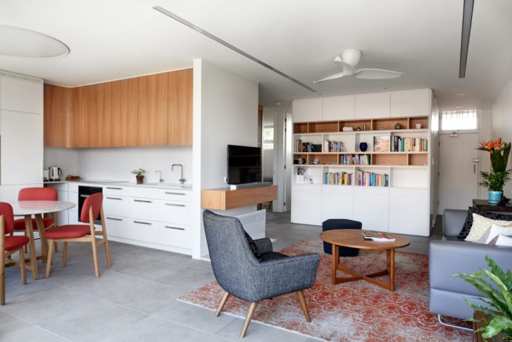
Next, the uncluttered sense of spaciousness was achieved with a restrained palette of three materials: white-painted walls and joinery throughout for the sense of lightness; textured stone-like floor tile throughout for that physical sense of grounding and seamless flow of space, and finally, adding warmth and colour through the introduction of Tasmanian Oak timber elements within the joinery.
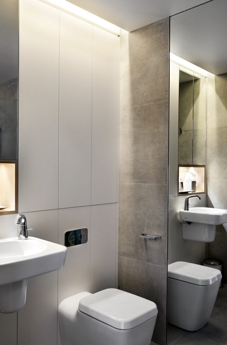
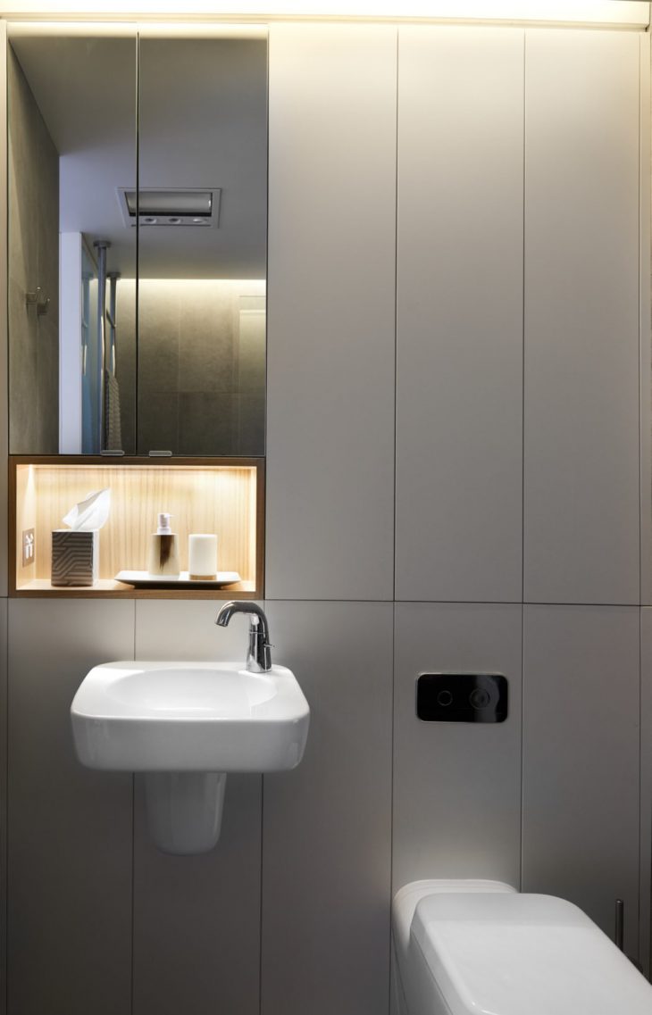
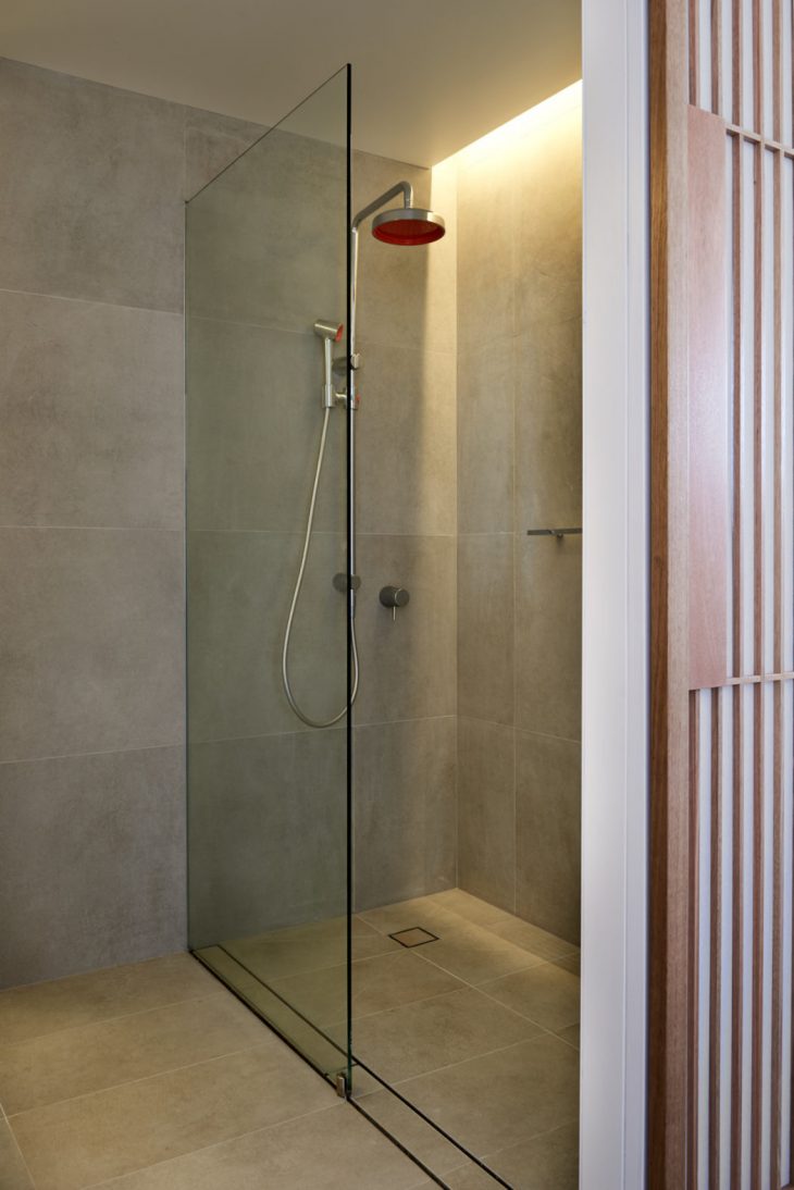
Further walls were removed to achieve a better flow of space, while a new, previously non-existent false ceiling was added throughout to facilitate the addition of new lighting and concealment of new and overhauled electrical, ducting and plumbing services. Existing bedroom door openings were raised to the ceiling in order to further reinforce the sense of light and space. Meanwhile, the original 60s internal bathroom was completely stripped and reconfigured to achieve sensible utility of space and admittance of borrowed light.
Furthermore, permission to was gained to punch a fixed glass window to the balcony wall to catch views of Sydney harbour, and full-height bi-fold doors replaced windows to the balcony to create a seamless indoor-outdoor connection especially during the warmer months.
In order to further soften the space, design cues were taken from the common areas of the building, which have retained original and elegant 60s architectural features such as subtle curves, rounded corners and stand-out circular elements, and echoed in curved and rounded corners to select wall corners, joinery and ceiling pelmets.
Much attention was also paid to the ceiling plan. The light fixtures must not only fulfil function and performance as per the client brief, but in my design mind, must also be able to define spaces in an open plan and meld into the architectural fabric. Wanting to avoid a “constellation” of downlights, I took the unusual step of using powerful yet responsive LED light fixtures that are normally reserved for office and commercial applications. Two flushed linear strips of light to define the living area, and one monumental, flushed circular fixture reminiscent of an architectural skylight from the progressive 1960s to both define and illuminate the dining and kitchen.
The end result is a non-threatening balance between high design sensibility and comfortable homeliness that fuses a “minimal” design language with hints of 60s “Mid-century” design touches befitting the vintage of the building itself, and leaving enough breathing room for the owner to leave his own personal mark of ownership.
Photography courtesy of Renjie Teoh