
Project: 'Iron Lace' Mansion
Designed by Gestion René Desjardins
Location: Montreal, Canada
Website: www.rdesjardins.com
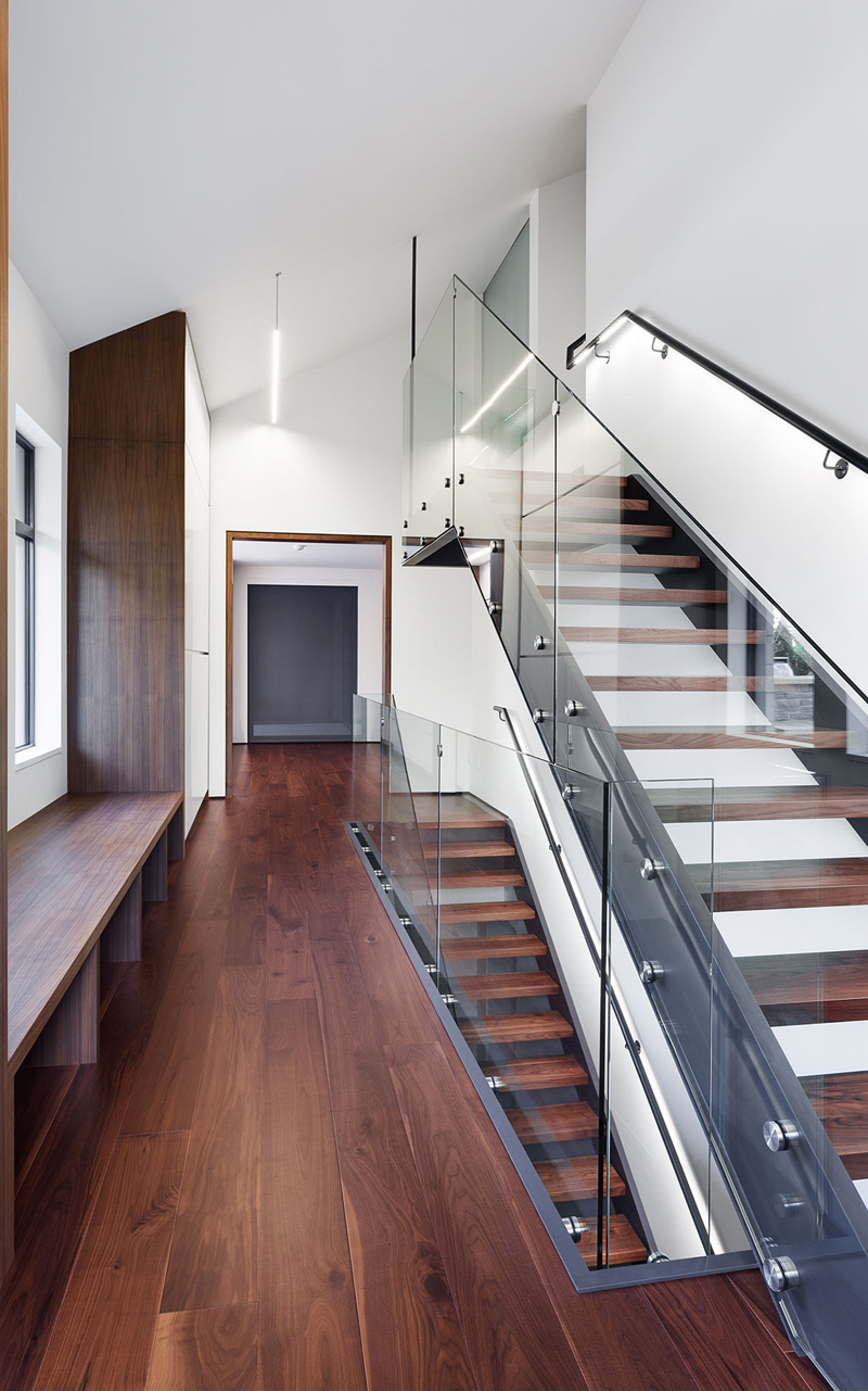
A three-story mansion project shaped for a couple who enjoys parties and contemporary art, and also parents three young adults. Family asked Gestion René Desjardins practice to help them with the design of their living space. Jewel of this entire interior space is an 'Iron Lace' staircase.
For more images continue after the break:


From the Architects:
“It’s a beautiful, calm street, lined with trees and 1960s bungalows. On the other hand, the house that these clients had bought was in such disrepair that it was beyond saving. The municipality had therefore granted us a demolition permit, on the strict condition that the new building follow the original plan. That was a real problem, since we needed to triple the livable space to meet the family’s needs. The husband, a tall, strapping extrovert, wanted a space that would reflect his size and personality. His wife, ever so pragmatic, insisted on easy upkeep and ample storage space.”
Many people find turning 50 a defining moment. It can be like a turning point, where suddenly you find yourself ready for change. For him – since, as his wife admits, this was his project – the change was triggered by a work of art by Ken Lum: Stop Living in the Past. Although he had previously been rather conservative, once he decided to go “contemporary” he began visiting modern art galleries and taking an avid interest in design. This included calling René Desjardins, whose work he had learned about through friends.
It was a good choice. The designer, who considers himself someone who “distills rather purifies,” takes umbrage with the dogmas of minimalism. His manifesto, "Less is More," always comes with comfort, sensuality and function. But also – and perhaps above all – the spaces he creates are a perfect fit with clients’ personalities and lifestyles. From the street the new house easily blends into its bungalow landscape. One floor, a long façade, a double-pitched roof; it’s all there. No-one would ever think that it harbours generous volumes on three levels. Because, even though the original architecture was maintained, inside the layout bears witness to the designer’s sheer inventiveness, achieved through an enormous amount of work. The slope of the roof at the back of the house, invisible from the street, was raised to recuperate space under the rafters. And the basement, excavated to below the water table, was given extraordinary height, to become an attractive living space. Liveable space was created under the roof of the garage, and the tight spaces of the former ground floor gave way to a wide-open space, worthy of an industrial loft.
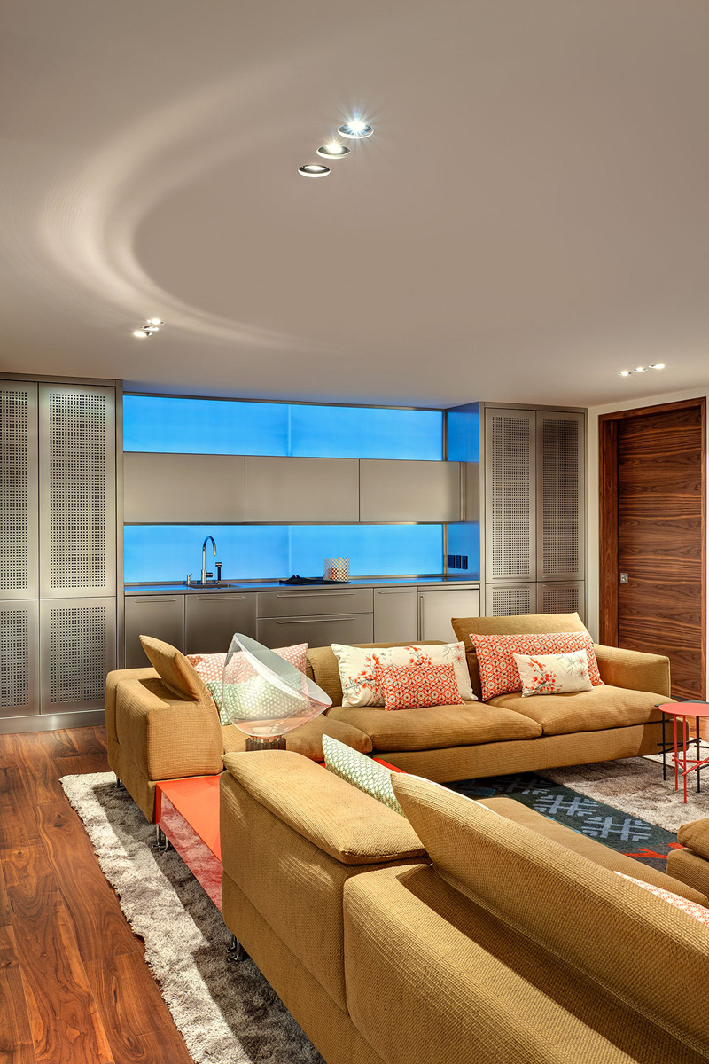
The fluid circulation that is so characteristic of the Desjardins style has here been rendered in such a way that cultured parents can easily cohabit with grown-up children seeking independence. In the vestibule next to the garage, a steel-and-glass staircase leads to both the guest suite and the basement, a place where the boys can be off on their own, enjoying the living room, the steam room/washroom and the home gym.
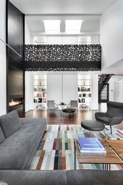
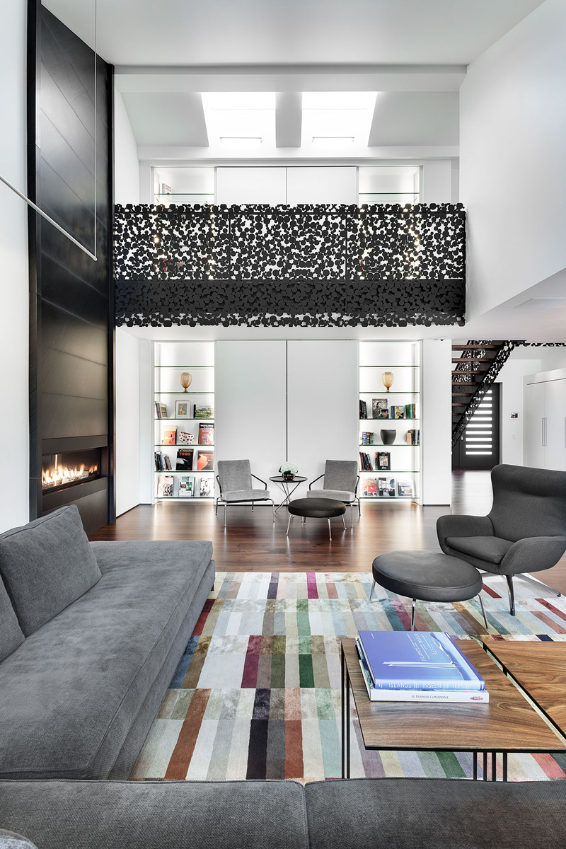
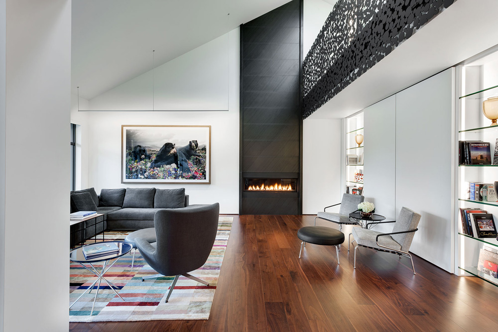
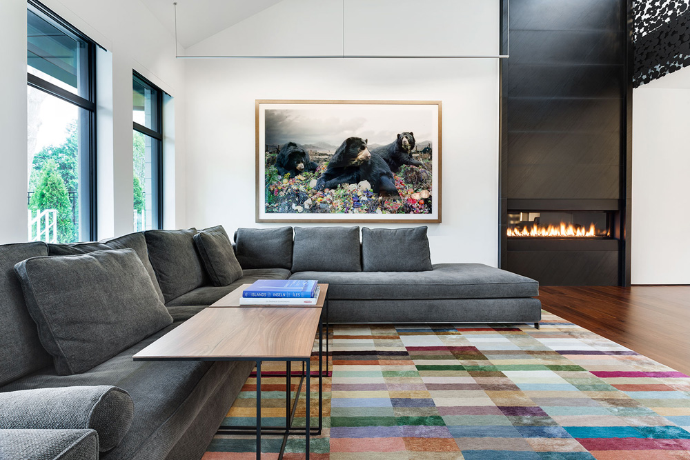
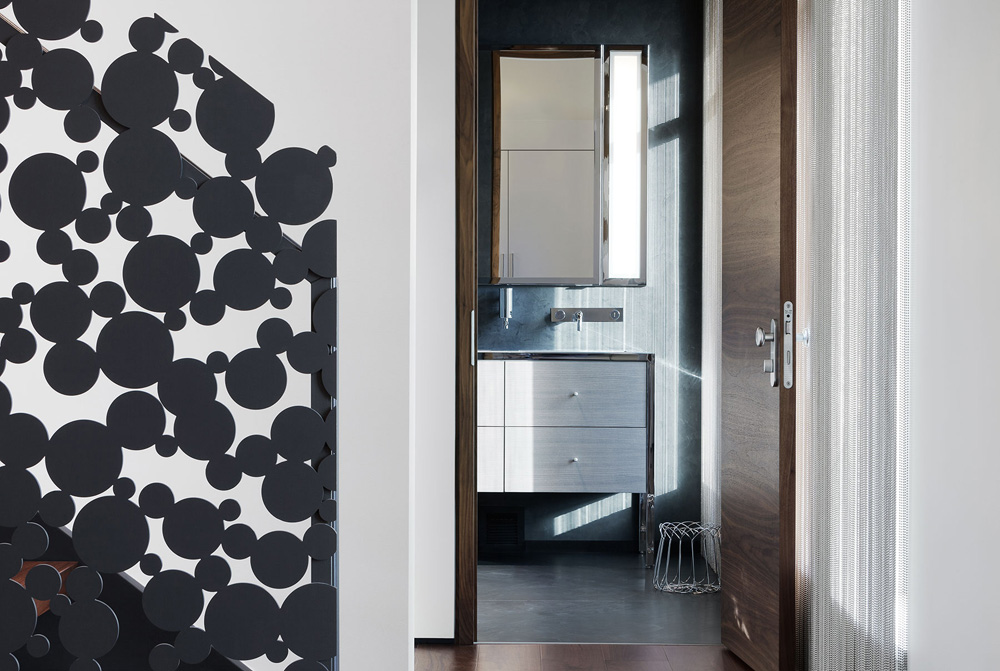
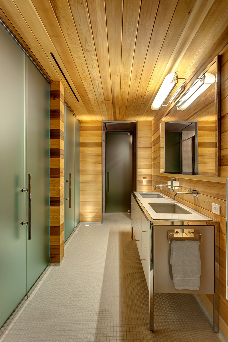
The ground floor foyer sets the tone. It is generous and unadorned, with the garden on the horizon and a spectacular staircase in anthracite iron lace. “It’s imposing,” admits the designer, “just like the owner….” Despite – or perhaps because of – the almost museum-like simplicity of the space, the sense of well-being is immediate, while the unity achieved through materials and colours establishes a chic simplicity. The walnut in the floors is carried through in the stair treads, the door frames and occasional tables; the same anthracite stone sheathes the chimney and washrooms; and the effect of the patinated stainless steel is sharpened by the metal bases of the furniture.
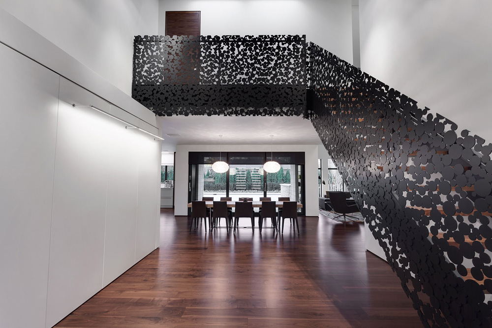
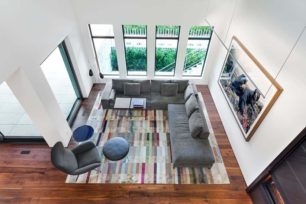
Set off by the multicoloured carpet, the use of classic black and white is tempered by monochrome warm greys, which has an unexpected effect derived from the ultra-graphic setting. The neutral palette serves to frame signed works by Jim Campbell, Simen Johan, Koka Ramishvili and Marc Seguin, the beginning of a promising art collection. The same can be said for the discrete lighting rails – the sole light source – and the niches, which will eventually house sculptures. In back-lit glass, the niches are repeated on the second floor and fill an entire wall that cuts, like a bolt of lightning, through the "Iron Lace" railing of the gangway leading to the couple’s private quarters.
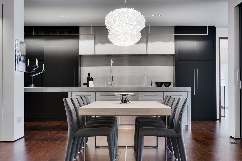
Just as ordered, the ground floor doubles as a living space and a setting for parties. The DJ can set up his gear on the immense island in the kitchen, and there is still room for the bar. Once the table’s leaves have been removed and stored away with the chairs in one of the many closets, the space can easily accommodate some sixty people, given the sparse furnishings. Clean design as an incentive to party: it’s a hit!