
Dama Studio Associati reimagined a Roman apartment by using color as a central element in both design and atmosphere. The studio took a measured approach, selecting every tone and surface treatment to work in harmony with the apartment’s existing furnishings and finishes. The result is a chromatic environment where deep, saturated colors define the character of each room.
Throughout the apartment, surfaces play a structural role. The designers applied a two-layer treatment using PerfectCombination and CoverHD by HD Surface. These products provided the base and finish for the walls, floors, and worktops, bringing texture and depth to the surfaces.
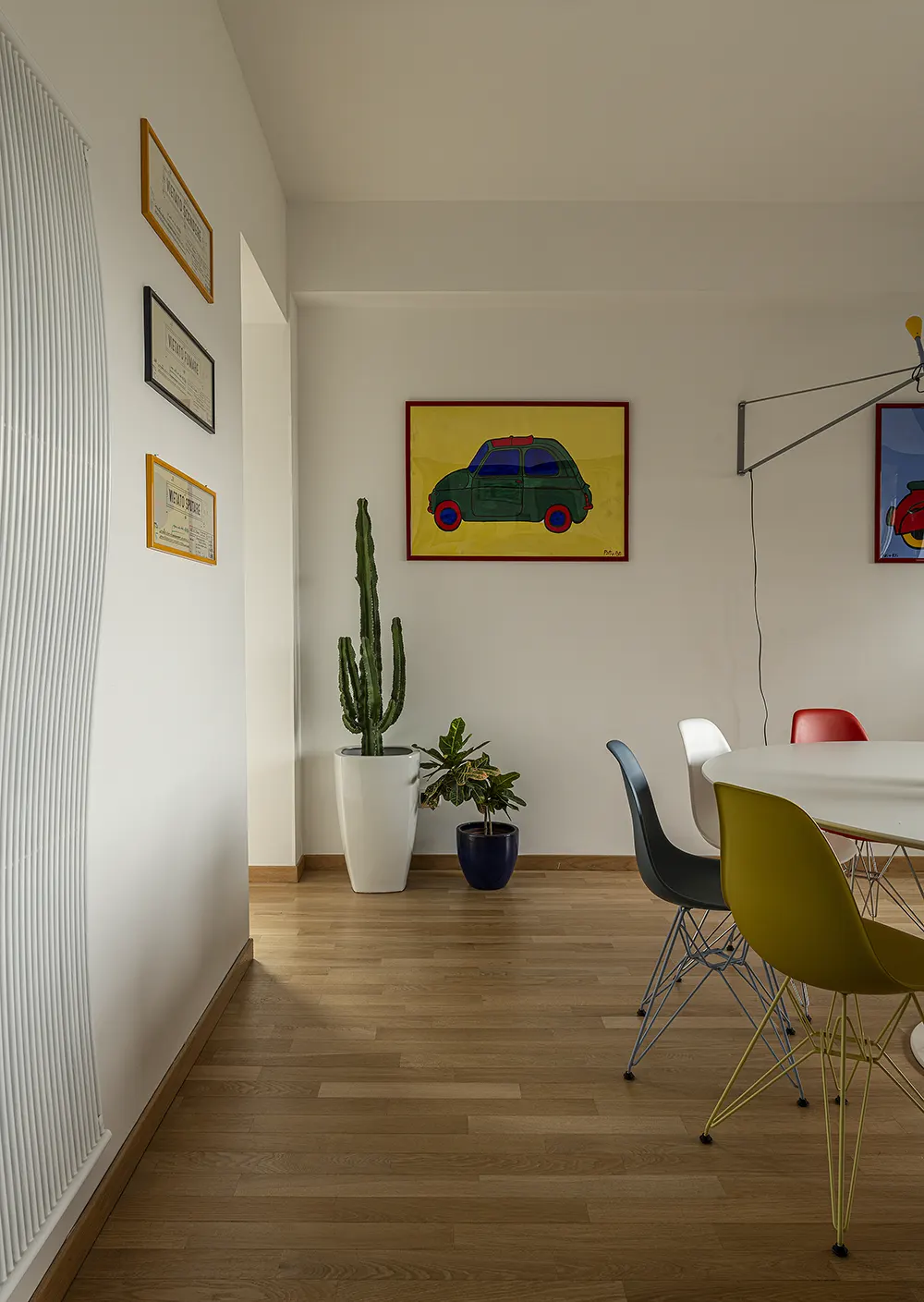
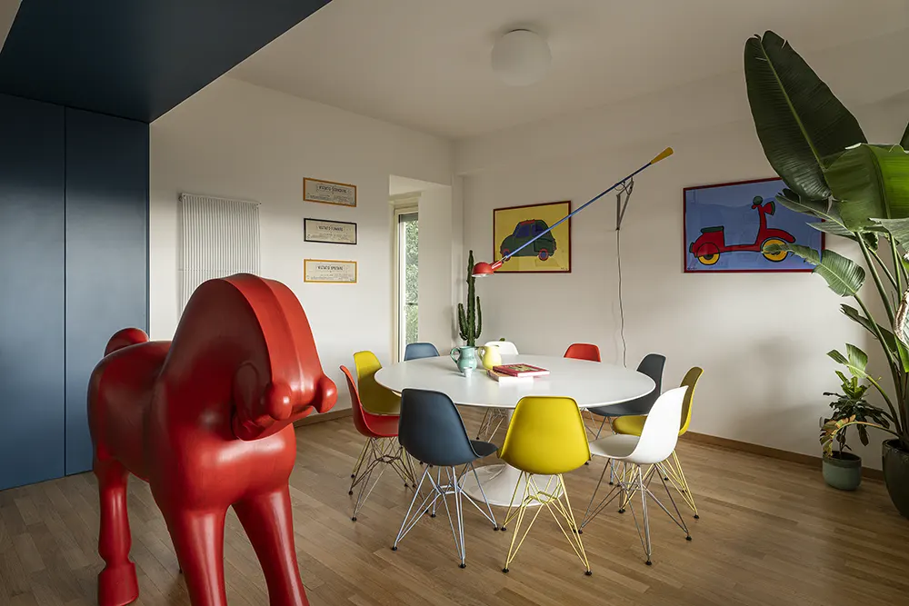
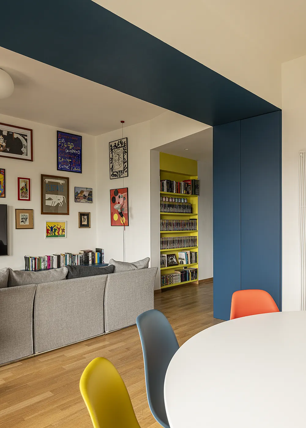
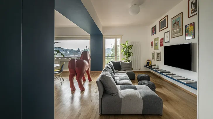
Living Area with Impact
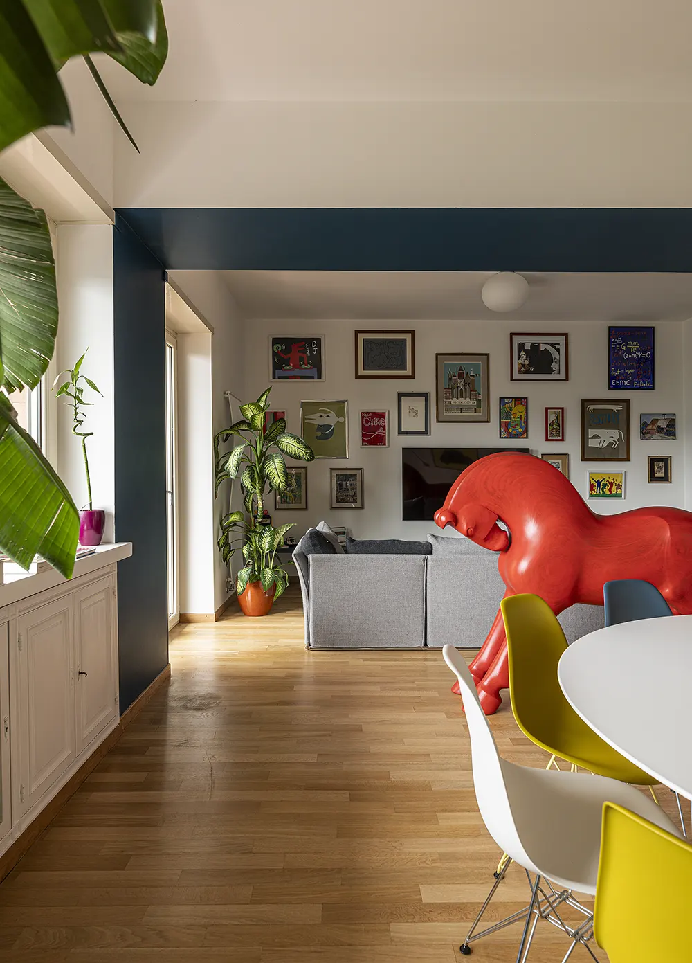
The living room draws immediate attention through its use of deep blue. The walls carry a dense, even tone that grounds the space and creates visual focus. This area features both layers of the surface treatment, which emphasize the room’s enveloping quality.
The most unexpected feature in the room, a red horse sculpture, sits at the center of attention. Coated entirely in CoverHD, it adds a sculptural volume and a vivid note that contrasts with the surrounding blue without disrupting the balance. This element introduces an artistic edge to a room built around material control and chromatic depth.
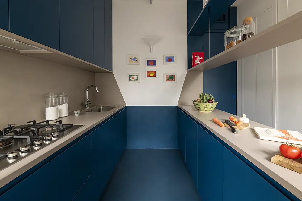
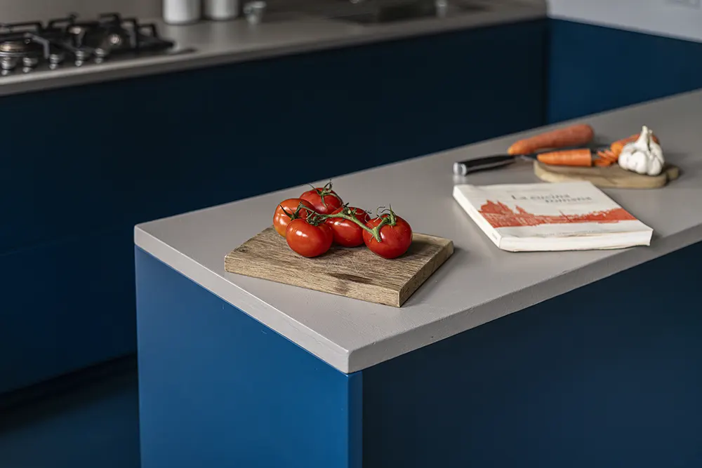
Unified Kitchen Surfaces
In the kitchen, the design team applied the same two-material system across floors, walls, and worktops. Grey-blue tones cover every surface, resulting in a unified and practical cooking space. The finishes create a clouded effect that feels consistent across vertical and horizontal planes. The matte finish softens the visual impact while maintaining surface durability. The materials perform beyond their visual qualities. They hold up to everyday use, bringing both practicality and clarity to a room where activity and cleanliness remain priorities.
Color as Structure in the Bathroom
In one of the bathrooms, the designers shifted to a green palette. The walls carry a soft but saturated tone that introduces calm and balance. The green, like the blue and grey used elsewhere, serves more than a decorative purpose, it structures the experience of the room. It supports the sense of privacy and enclosure necessary in a space designed for rest and routine.
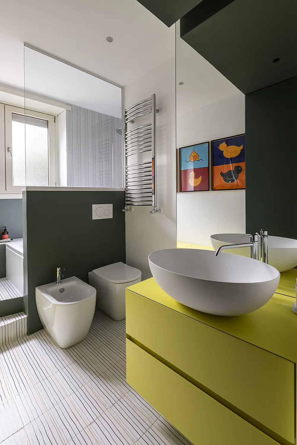
The same material approach appears here again, working well in moisture-prone conditions. The two-step application stays durable with regular use, while the matte finish maintains the calm, grounded atmosphere found throughout the apartment.
Location: Rome, Italy
Year: 2025
Interior designers: Dama Studio Associati
Products: PerfectCombination and CoverHD for walls and ceilings (blue, grey, and green tones)
Photo credits: Vito Corvasce