

Have you ever stared at a bright blue sky and felt an overwhelming sense of calm? What about a glaring, red stop sign that caught your attention and stopped your heart for a moment? Or maybe a vivid orange that made you want to get up and be active? There’s an actual explanation for this. When viewed, different colors can evoke a specific emotion within the brain. Why is this? Most scientists believe that this is a result of our evolution, where humans would associate specific colors with certain outcomes and emotions. Basically, if a snake with red stripes on it was dangerous, our minds would associate red with danger.
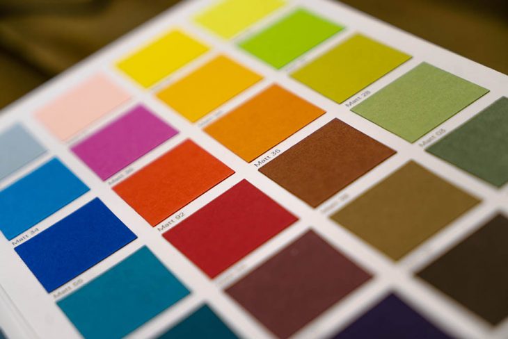
Knowing this, it’s possible to choose the right color to create a specific, emotional response when entering a room. Let’s take a brief look at some of the main color choices and how they make us feel when viewed.
Red
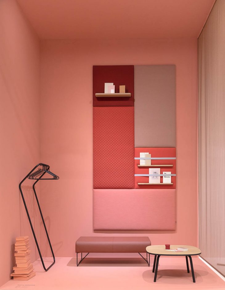
Red, often considered the color of energy and excitement, is a bold choice in the realm of interior design. Its vivid hue has the unique ability to evoke powerful emotions ranging from passion and love to anger and power. Historically, red has been associated with both luxury and vitality, and its presence in a space instantly commands attention.
In interior spaces, red can be particularly effective in invigorating areas meant for interaction and engagement. Living rooms, for instance, can greatly benefit from a red accent, fostering lively conversations and vibrant gatherings. Similarly, entryways painted red or adorned with red décor welcome visitors with an undeniable warmth and energy, setting the tone for the rest of the home.
However, the key to successfully integrating red into one’s décor lies in moderation. While a full red-painted room might overwhelm the senses, subtle introductions of the color can be both elegant and electrifying. A strategically placed red chair, throw pillow, or even a cabinet can transform a space from mundane to mesmerizing. Such accents not only enliven the surroundings but also act as focal points, guiding the eyes and offering visual breaks. Ultimately, in interior design, red is not just a color; it’s an experience, a statement, and a reflection of a homeowner’s boldness and flair.
Orange
Orange, a captivating blend of red’s passion and yellow’s joy, offers a burst of enthusiasm and warmth in the realm of interior design. Embodied with vivacity, it conjures feelings of energy, excitement, and a zest for life. Its lively nature makes it an ideal choice for spaces meant to invigorate and stimulate.
Given its energetic essence, orange thrives in areas where movement and activity are at the forefront. Exercise rooms adorned with orange accents or walls can motivate individuals, making workouts feel less tedious. Similarly, playrooms, illuminated by this vibrant hue, can become hubs of creativity and playfulness, enticing children to unleash their imaginations.
Moreover, the inherent cheerfulness of orange finds its way into rooms tailored for younger occupants. Nurseries and daycare centers splashed with shades of tangerine or peach can foster a warm, nurturing environment, encouraging growth and exploration. Even a touch of orange, be it in furniture, artwork, or textiles, can infuse a sense of joy and vibrancy.
In the symphony of interior design, orange plays the upbeat, energetic note, reminding inhabitants of the vivacity and warmth of life’s many experiences.
Yellow
One of the last warm colors, yellow is the brightest of the three colors. Associated with joy and happiness, yellow captures great feelings, sunshine, and warmth. It can be used to great effect in kitchens, bathrooms, and living room spaces. Yellow pieces of/art and even flowers like daisies can add a pop of color to rooms as well.
Blue
Now, on to the cooler colors. The polar opposite of red, blue colors are known to represent calmness and rebirth, lowering the heart rate and blood pressure when viewed. Bathrooms, bedrooms, and areas around a pool are ideal places for this color; however, blues can be used in nearly any type of room.
Green
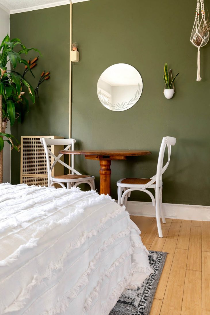
Similar to blue, green is said to be a “restful” color. When viewed, green produce calm feelings, reduces stress, and is even said to increase fertility. Apply your desired green color to living rooms, bedrooms, and bathrooms for maximum benefits. Also, adding plants and other green, natural elements can a similar effect.
Purple
Purple is a dynamic color that can range from dark violets to lighter lavenders. Depending on the hue, purple can represent rich sophistication or simple relaxation. Offices, bedrooms, bathrooms, and living rooms can implement the right shade of purple to great effect. Bright purples can be great for playrooms and daycare centers.
Black and White
The yin and yang of colors, black and white are timeless colors that can complement every other color when used properly. Whites can make room and spaces feel more open while black is a great accent color that adds depth and texture. Here is how to make a bold design statement with black peel and stick wallpaper. Both of these colors can be used in any room if applied correctly.