
Andrew Franz of Andrew Franz Architect (AFA) speaks with ARCHISCENE Magazine about the renovation of a 1950s Greenwich Village pied-à-terre overlooking Washington Square Park. In this exclusive interview with editor Zarko Davinic, he unpacks the challenges of reworking a compact post-war apartment and shares how thoughtful spatial planning, rich textures, and sculptural forms brought the residence to life.
The conversation explores the influence of mid-century proportions, the choice of materials like fluted wood, Venetian plaster, and bronze, as well as the role of natural light in shaping the interior experience. With features like a custom daybed positioned for uninterrupted park views and built-in moments throughout, the design invites intimacy without sacrificing depth or personality. Franz reflects on the collaboration with artists, the importance of natural materials, and the influence of his upbringing between Brooklyn and coastal New England.
What was the primary inspiration behind the transformation of the Washington Square Park Pied-à-Terre?
The client (empty nesters) asked us to renovate a two-bedroom, two-bathroom post-war apartment lacking in character and with an awkward layout that obstructed light and views. The goal was to create an inviting abode that reflected the client’s chic and understated, glamorous personal style while maximizing light and the charming village views adjacent.
How did you approach the challenge of revamping the awkward layout and small partitioned rooms of the 1950s building?
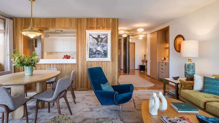
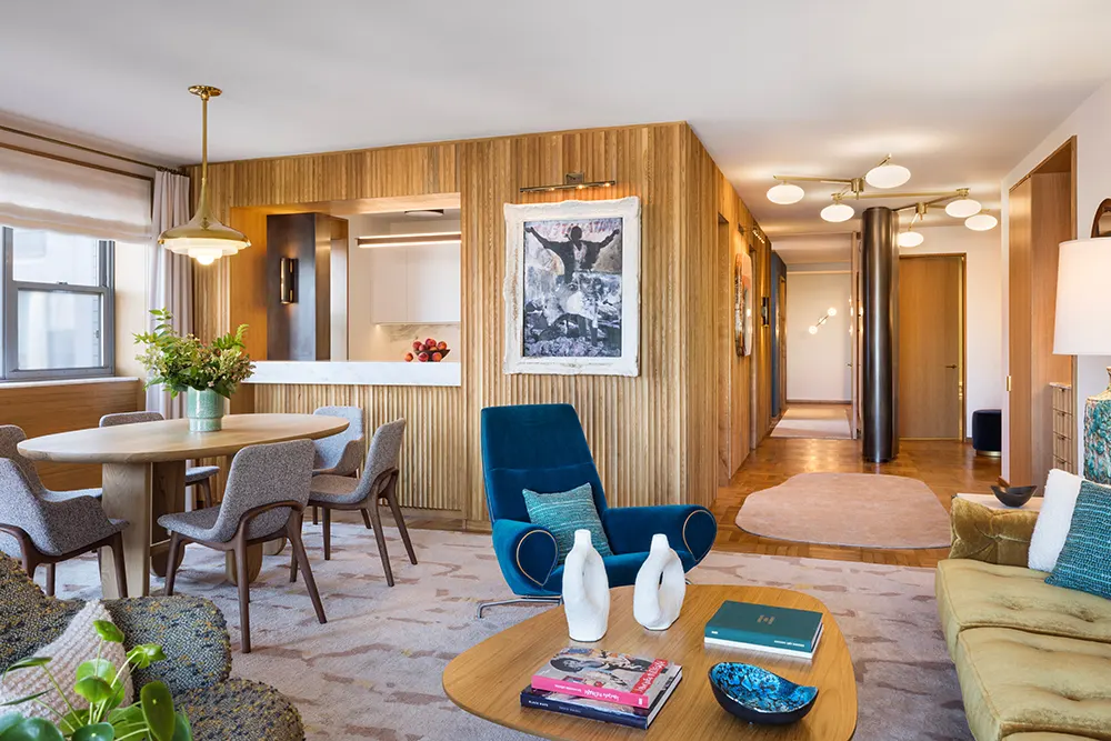
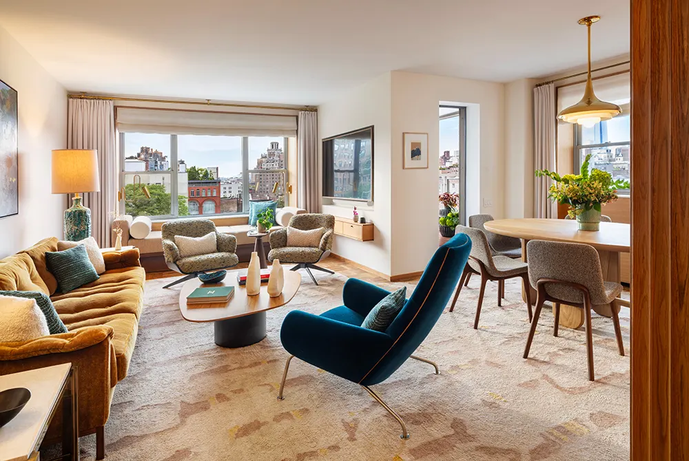
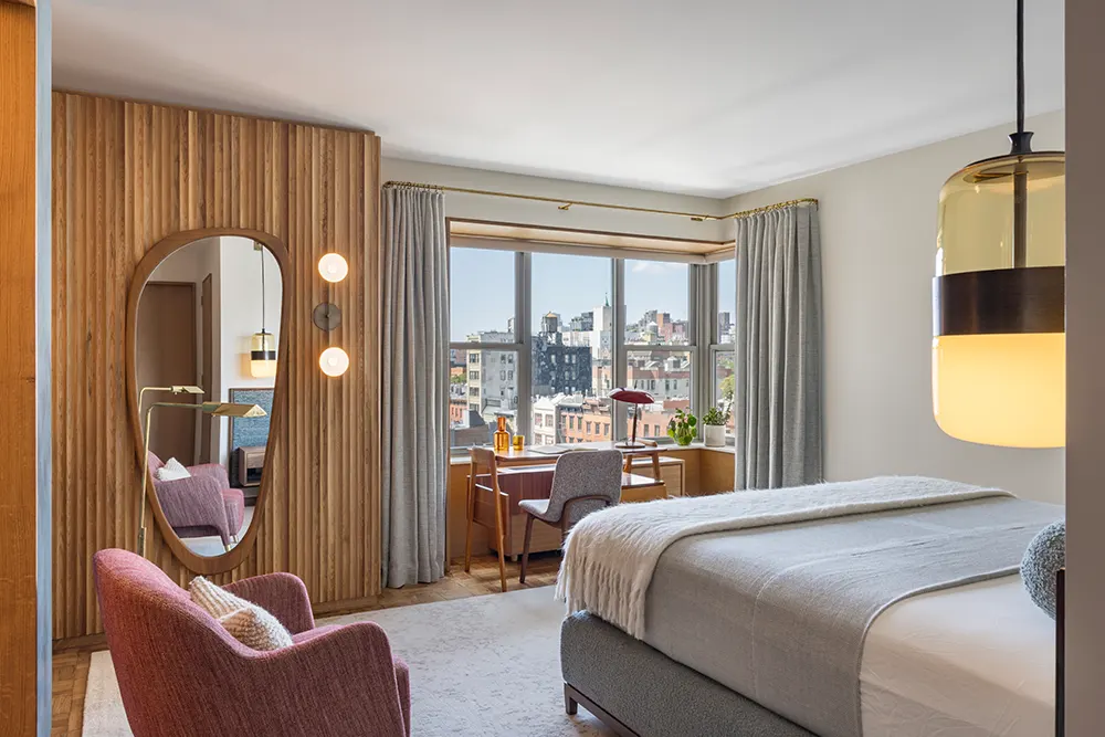
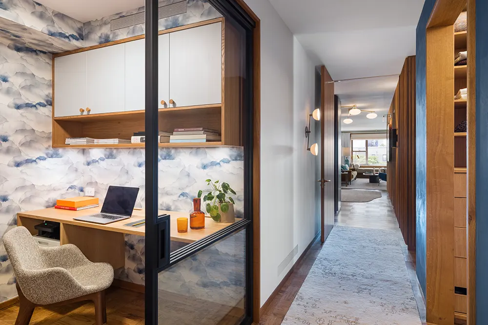
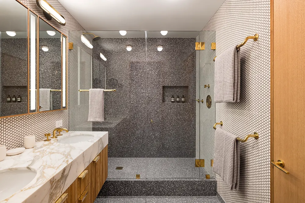
One challenge was to add personality and proportion to a rectilinear 1950s apartment that had been combined but was chopped up into small rooms. This was initially done by editing/removing partitions and creating more open spaces and views. We then organized the small functional spaces behind the scalloped wall paneling to add warmth and introduced color through blue Venetian plaster and terrazzo to distinguish other spaces. Throughout, a luxe lens of rich tones in the furnishings, upholstery, lighting, and art complements the interior’s mid-century lines. The intimate size of the apartment is embraced with many smaller poetic moments, such as a glazed home office with nebulous wallpaper that complements the adjacent venetian plaster, a built-in study nook in the second bedroom, the bronze sculptural entry column or the most comfortable daybed at the living room window where you have full views of the historic neighborhood and park.
Can you elaborate on the design process for incorporating the client’s understated glamorous personal style into the space?
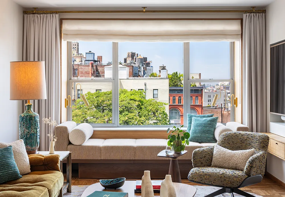
This 1,400-square-foot Washington Square Park Pied-à-Terre was transformed from a post-war apartment into a warm abode to reflect the client’s chic personal style. Abundant curves and textures were introduced to an otherwise rectilinear 1950s apartment. The renovation opened the residence to multiple interior and exterior views and plentiful natural light. The warm palette is complemented with pops of color, while scalloped walls and Venetian plaster define functional areas. The generous day bed provides views of the park and can accommodate two.
The use of texture and color is striking in this project. What guided your choice of jewel tones, soothing hues, and materials like Venetian plaster?
Art aside, the apartment is less colorful than it appears. There are recurring accents in shades of blue that play off the warm woods. The clients didn’t want a white box and loved blue. We physically organized the spaces and circulation in a simple and coherent manner and used the fluted wood and Venetian plaster to visually reinforce the same. They also have a dialogue between each other in the primary bedroom. We didn’t want everything to be wood.
The scalloped wood paneling and custom bronze panels are standout features. What was the inspiration behind these design elements?
In such a generic apartment, we wanted to introduce materials that elevated the character yet felt appropriate and could have been original. The apartment is not trendy. The goal was to feel chic while drawing inspiration from the 50s. In some ways, it felt like a vintage yacht. The bronze conceals electrical risers and panels. If we were going to have to have an object in the entry, we decided we should embrace it, not minimize it. So that is our “Henry Moore” tribute -maybe that’s a stretch, but it is a beautiful and organic form in an otherwise rectilinear space.
How did you integrate the park views into the design, particularly with the custom-designed daybed in the living room?
The modernist building is nestled into the heart of Greenwich Village. It looks out onto a mews of 19th century buildings with some early 20th century buildings beyond and the park to the south.. The goal was to shift the occupancy toward the windows to celebrate the charm of the village and serenity of the park. The daybed flanks the windows and the chairs (there are actually 2) swivel, so 4 people can congregate by the windows.
Could you share more about the collaboration with artists like Antony Densham, Nick Cave, and Lola for the finishing touches?
This was easy and collaborative. We suggested locations and sizes, and the clients shopped for the art and sent us things they liked. We got lucky… art can unite or divide opinions. In this case, it was the former.
How does this project reflect your philosophy of integrating interiors and architecture to create a cohesive narrative?
There is synergy between the architectural materials and furnishings. They work together, not apart. We viewed the wood paneling as furniture and developed it with the interiors. The wood became the backdrop for the soft fabrics and organic shapes. Even the living room rug, by Carini, is serpentine-shaped. We used sculptural lighting to make statements in dark areas so they felt animated and would reinforce the warmth of the wood.
Sustainability is a key focus in your work. Were there specific sustainable practices or materials used in this project?
LOW VOC finishes were used and all upholsteries are natural fiber. We embrace natural materials.
Looking at your career, how has growing up in both urban Brooklyn and rural coastal New England influenced your design approach and projects like this one?
I’m polychromatic for sure. Growing up in NY creates an appreciation for all cultures. The ethnic diversity makes NY a food and cultural powerhouse, while the architecture and energy create constant stimulation. It nurtures curiosity and the idea of integrating different ideas together- no monotony or beige.
But we all need nature; the colors, smells, and silence. For some, it’s the mountains; for others, it’s the sea. I’m a salty guy. The ocean and the environment it fosters provides endless inspiration. I’ve drawn color palettes from tidal pools for urban apartments. But this appreciation of nature, ultimately, drives our love of natural materials rather than synthetic ones; live sawn wood, natural stone, natural fibers. There are ways to bring nature into interior spaces, creating variation and effect rather than flatness. We approach all projects through a lens of openness and light, creating connections to the outdoors. For this project, we introduced a lot of wood and some bronze to bring warm tones, particularly at night, and then relied on rich fabrics and carpets to provide softness and interest. The carpets are all custom-made by Joe Carini, made in India and Nepal using natural wools and silks. The abrash effect in carpets is similar to the variation you see in flowers or leaves.