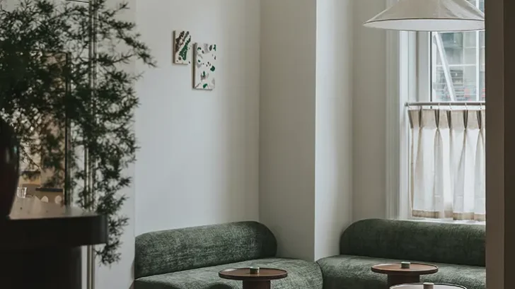

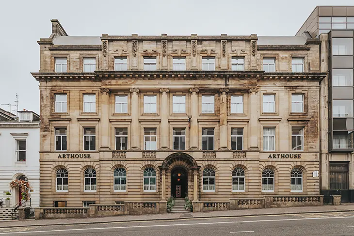
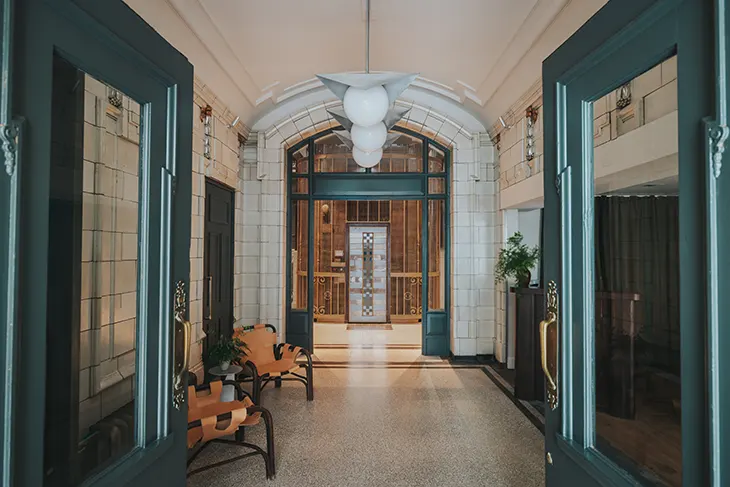
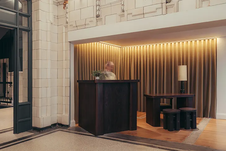
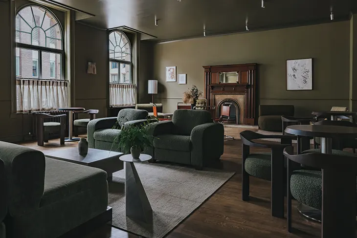
A-nrd approaches the design of Arthouse Glasgow through the character and spontaneity of artists’ homes, transforming a restored 19th-century building on Bath Street into a 76-room hotel. Developed for Oberland, the project draws on Glasgow’s architectural history and creative culture, combining original Victorian features with contemporary furniture, vintage pieces and the work of local artists and makers. Dark timber, rich colours and carefully selected materials establish a residential atmosphere throughout the hotel. In the newly completed suite, original blue fireplace tiles inform the colour of bespoke furniture and upholstery, while curved sofas introduce softer forms alongside historic timber panelling. The compact Pocket rooms apply the same design approach through integrated joinery, window-facing beds and carefully considered details.
INTERVIEWS
The project examines how a hotel can retain the individuality of a private residence across different room sizes and architectural conditions. In an interview with ARCHISCENE Magazine Editor-in-Chief Zarko Davinic, Alessio Nardi, founder of A-nrd, and Lukas Persakovas, creative partner, discuss the decisions behind the suite and Pocket rooms, from the use of blue inspired by Glasgow’s Victorian tiles to the development of multifunctional furniture for compact interiors. The conversation also explores the preservation of original architectural details, the collaboration with local glass artist Vicky Higgins, and the balance between bespoke design and vintage furnishings. Nardi and Persakovas reflect on working with Oberland and developing a consistent identity across six guestroom categories while allowing each space to retain its own character.
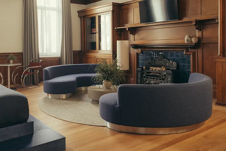
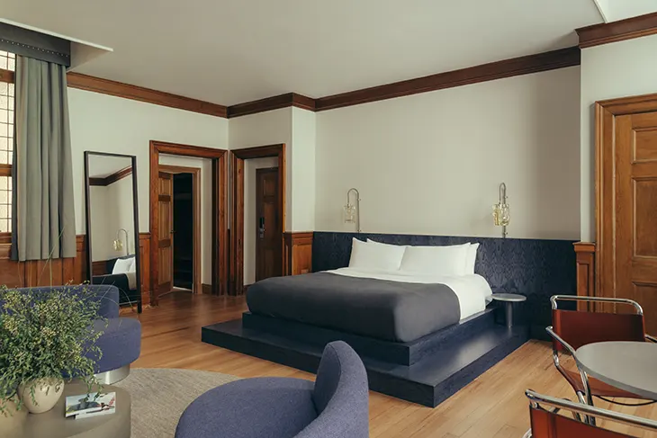
The deep blue of the original fireplace tiles runs through the whole suite, from the bed to the sofas. Was that colour in your plans from the start, or did it take shape after you saw the tiles in person?
AN: We wanted every addition to the suite to be unapologetic and clearly recognisable within the historic setting of the room, without trying to blend into it. That led us to the idea of a bespoke oak platform bed stained in a bright, saturated colour, with the grain of the timber still visible beneath.
We actually tested two directions, a deep forest green in keeping with the rest of the guestrooms, and the blue you see now. The blue felt far more fitting, sitting naturally alongside the original fireplace tiles. From there, we carried the same tone into the textured upholstery of the curved sofas and the smaller details, creating a restrained palette that connects the Victorian features with the contemporary pieces we’ve introduced, without everything needing to match exactly.
We wanted every addition to the suite to be unapologetic and clearly recognisable within the historic setting of the room, without trying to blend into it.
The tiles echo the decorative entrance halls and stairwells of Glasgow’s Victorian tenements. What did you learn about those tiles during research, and how much of that history do you want guests to notice?
AN: We were particularly interested in the use of richly coloured glazed tiles within Glasgow’s Victorian architecture, especially in the communal entrances and stairwells of traditional tenement buildings. It’s a decorative detail that feels very characteristic of the city, and finding that same deep blue within the suite’s original fireplace gave us an opportunity to make a connection between the building and Glasgow’s wider architectural history.
We don’t necessarily expect guests to recognise that reference immediately. What’s more important is that the interiors feel connected to their surroundings. If someone notices the relationship between the fireplace and the furniture, or recognises a colour they’ve seen elsewhere in Glasgow, that’s a lovely additional layer to their experience.
The suite keeps its dark timber panelling and oversized fireplace but is paired with soft off-white walls and pale grey linen. How did you decide how much of the original richness to keep and how much to lighten?
LP: The existing timber panelling and fireplace are incredibly beautiful features, and we felt it was important to preserve as much of that character as possible. The fireplace, with its substantial mantelpiece and built-in bookshelves, gives the room a real sense of grandeur, and we wanted to celebrate that.
At the same time, it needed to feel like somewhere you could spend an entire afternoon, not simply admire the architecture. We introduced soft off-white walls and full-length pale grey linen curtains to bring lightness to the room and create a softer backdrop for the furniture. The original timber floorboards also help give the space that domestic quality. For us, it was about allowing the Victorian features to remain prominent while making the suite feel comfortable, relaxed and welcoming.
The bespoke curved sofas have low, rounded forms and brushed stainless steel bases, in a room with formal Victorian architecture. What made you choose that contrast?
LP: We wanted to introduce furniture that felt distinctly contemporary against the formality of the existing architecture. The room has these wonderful strong lines, substantial timber panelling and an oversized fireplace, so the idea was to bring in something softer and more playful.
The curved sofas have a very low profile, which allows the architectural features behind them to remain visible, while their rounded forms create a more informal seating arrangement around the fireplace. The brushed stainless steel bases introduce another material into the room and give the sofas a slightly lighter appearance. It’s quite a deliberate contrast, but one that makes the suite feel more like a private sitting room, where furniture from different periods can sit comfortably together.
It’s that mixture of different periods, materials and approaches to making that gives the hotel its character.
The Pocket rooms use fitted timber units that wrap the bed and become a desk. How did you design for a compact footprint without the rooms feeling like cabins?
AN: The starting point was to consider how we could retain the character and comfort of the larger guestrooms within a much smaller footprint. We had already developed a distinctive platform bed for the hotel, so we took that same design language and adapted it to suit the proportions of the Pocket rooms.
The beds are conceived as fully fitted pieces, with dark stained timber wrapping around the sleeping area and continuing along the adjoining wall to form a desk. It creates a cocooning effect, which we actually wanted to embrace, but the important thing was to keep the rest of the room feeling open. We paired the dark timber with soft off-white walls, used an open wardrobe arrangement and incorporated practical details such as concealed sockets and task lighting into the joinery. The furniture has several functions without the room feeling overly furnished. We also introduced a rounded chair in olive-green bouclé, which brings some softness and personality to the space.
In the Pocket rooms the beds face the windows, which open onto a courtyard with reeded glass. Why was that orientation important, and did the planting in the courtyard change your approach?
AN: Positioning the beds towards the windows was something we explored throughout the hotel, including in the larger guestrooms. We wanted guests to experience the room from a different perspective, with the window becoming the focal point when they’re sitting or lying in bed.
That was particularly important in the Pocket rooms, where the orientation helps create a greater sense of openness despite the smaller floor area. The windows overlook an internal courtyard, so privacy was obviously a consideration. The reeded glazing helps address that, while still allowing daylight into the rooms, and the courtyard planting introduces a natural element. Even though you’re looking into an internal courtyard, there’s still that connection to greenery, which makes a real difference to the atmosphere.
Wooden venetian blinds and reeded glazing give the rooms a retro, cinematic feel. Were there particular films, places or periods you referenced, or was the goal mainly a sense of privacy?
LP: Privacy was certainly an important consideration, given that the Pocket rooms overlook an internal courtyard, but we also wanted the window treatments to contribute to the atmosphere of the rooms. The wooden venetian blinds have a slightly nostalgic quality that we really liked, particularly alongside the dark stained timber furniture and the textured glazing.
They also allow guests to control the light throughout the day, which brings another dimension to the room. There’s something quite cinematic about the way light filters through the slats, creating patterns across the walls and furniture. It adds a little character to what could otherwise have been a purely practical design decision.
We shared an ambition to create a hotel that felt genuinely connected to Glasgow, celebrating the building’s history and the city’s creative culture.
The articulated wall lights were made with Glasgow glass artist Vicky Higgins. How did that collaboration begin, and what did you ask her to achieve with the handblown amber glass?
AN: We were looking for local makers to involve in the project and came across Vicky’s work. We’ve always been drawn to the imperfect quality of handblown glass and felt it would work particularly well at Arthouse, where craftsmanship and the work of local artists are such important elements of the design.
We began with an initial brief exploring several possibilities for the shape and construction of the shades, all drawing on Glasgow’s industrial heritage. One direction incorporated a metal mesh finish, while another explored a geometric arrangement of stacked glass forms, loosely referencing the architecture of Glasgow’s city centre. We ultimately developed the latter, combining the articulated metal arms with handblown glass shades.
For the glass itself, we wanted to introduce several subtle tints of clear glass in yellow and orange tones, giving the shades variation in colour and a warm quality when illuminated. The resulting lights bring a distinctive handcrafted element to the guestrooms while remaining functional as bedside lighting.
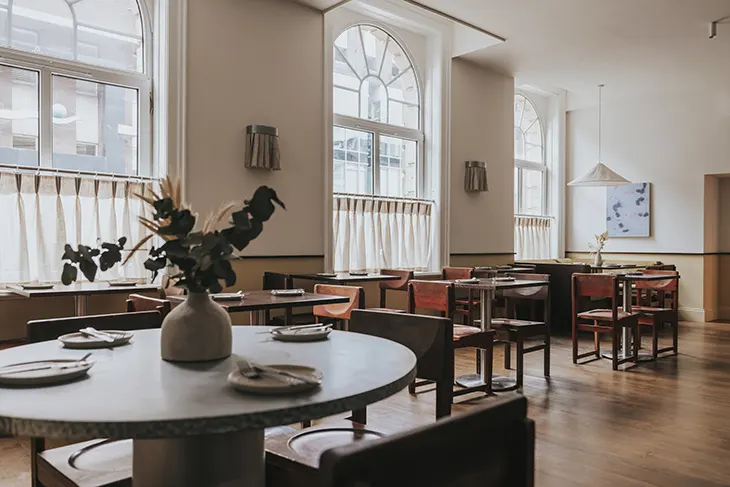
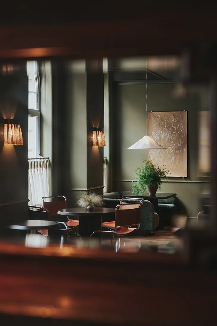
The hotel mixes bespoke pieces with vintage Mies van der Rohe chairs and West House Pottery wall knobs. How do you decide when to commission something new and when to source something existing?
LP: We never want a space to feel as though everything has been purchased at the same time. In a residential interior, furniture and objects tend to accumulate over the years, and that sense of individuality is something we wanted to bring to Arthouse.
We design bespoke pieces when there’s a particular functional or architectural requirement, or when we feel we can create something that contributes to the identity of the project. The platform beds are a good example, because they allowed us to develop a distinctive design that could be adapted across different room categories. But we also love incorporating vintage furniture and working with independent makers. The Mies van der Rohe chairs bring a completely different design language into the suite, while the handcrafted ceramic knobs by West House Pottery introduce a small decorative detail to the open wardrobes. It’s that mixture of different periods, materials and approaches to making that gives the hotel its character.
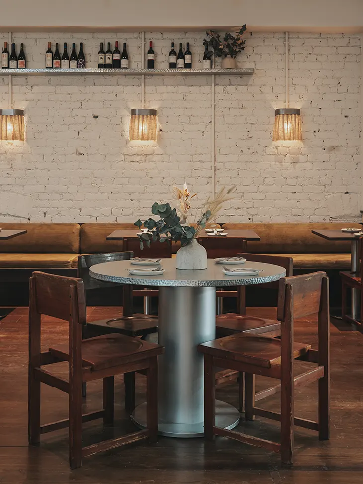
Arthouse Glasgow is Oberland’s first hotel under its own brand, and it has 76 rooms across six categories. How did you balance the client’s brand goals with the residential approach your studio brings, and was there any point where you had to push back?
AN: It was a very collaborative process, and Oberland placed a lot of trust in us, which allowed the project to develop quite naturally. We shared an ambition to create a hotel that felt genuinely connected to Glasgow, celebrating the building’s history and the city’s creative culture.
One of the challenges was translating that vision across 76 rooms and six different categories, each with its own proportions and architectural features. We didn’t want to create a standardised interior and simply repeat it throughout the building. Instead, we developed a family of bespoke furniture, lighting and material details that could be adapted to suit each room. The platform bed is probably the clearest example, appearing in different forms from the larger guestrooms through to the compact Pocket rooms.
That allowed us to create a consistent identity without losing the individuality of the spaces. There were a few moments when we challenged the initial direction. Early on, there was a desire to use green as the main accent colour throughout the hotel. While that works beautifully across most of the guestrooms, we felt the restaurant and suite needed their own identities. We pushed back a little on maintaining the same palette everywhere, particularly in the suite, where the blue felt much more appropriate alongside the original fireplace tiles. It was a relatively small decision in the context of the wider project, but an important one in allowing each space to have its own character.