

Giacomo Totti‘s collection for De Marchi Verona is a testament to his multidisciplinary approach and creative vision. The collaboration between the renowned designer and the esteemed brand has resulted in a captivating collection that merges artistic inspirations with the craftsmanship of porcelain. With an extraordinary attention to detail and a passion for sophisticated aesthetics, Totti has created a range of surfaces that redefine the possibilities of porcelain in the world of design.
The collection showcases Totti’s ability to intertwine a diverse array of influences, ranging from modernism and Art Deco to the works of 20th-century Italian maestros. Totti’s unique perspective as a professional musician, globetrotter, and collector shines through in the collection, where references to distant cultures from the East and South America find their place alongside contemporary architectural trends. This continual exchange of ideas and a short circuit of influences come together to form surfaces that exude vibrancy, elegance, and an unmistakable sense of refinement.
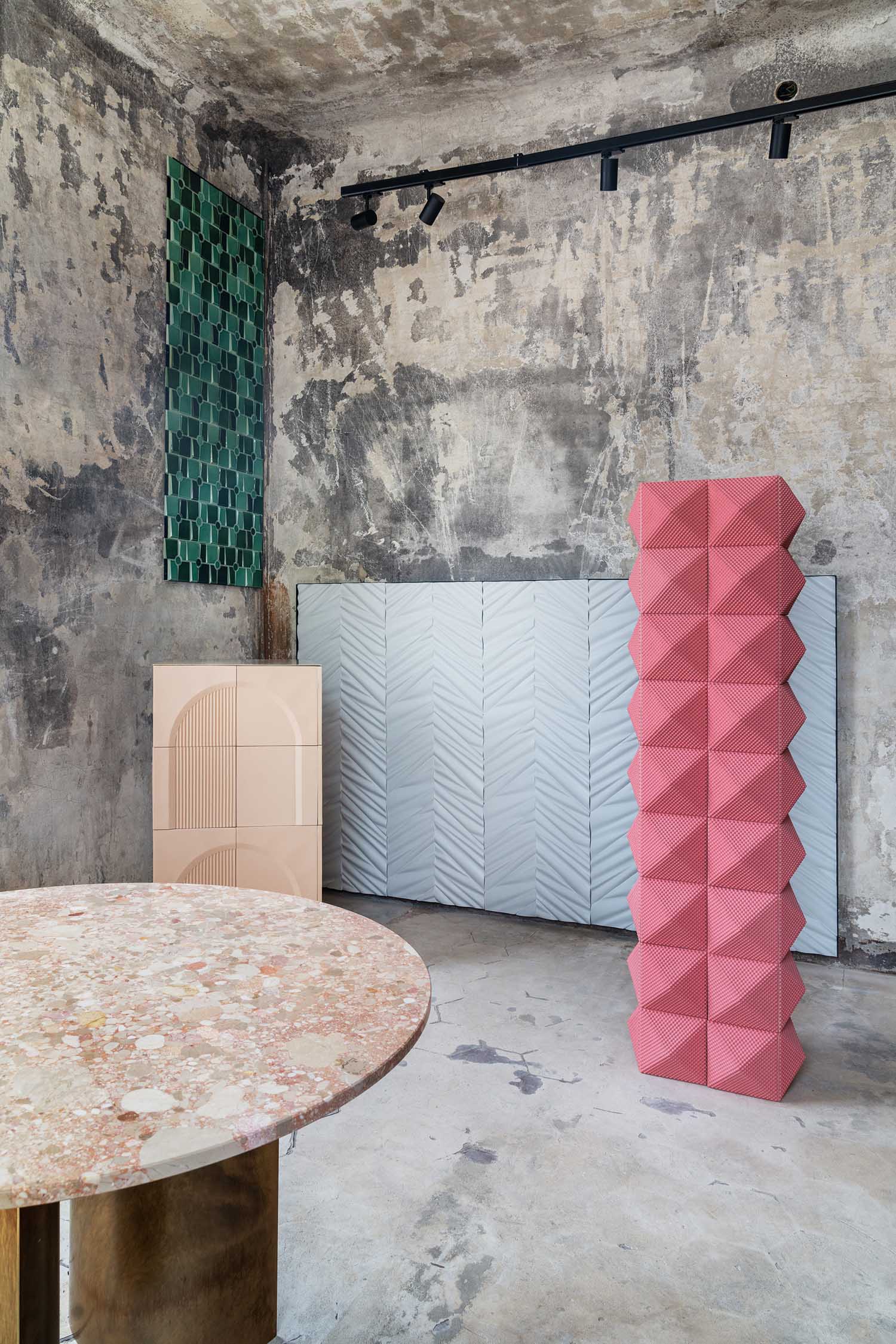
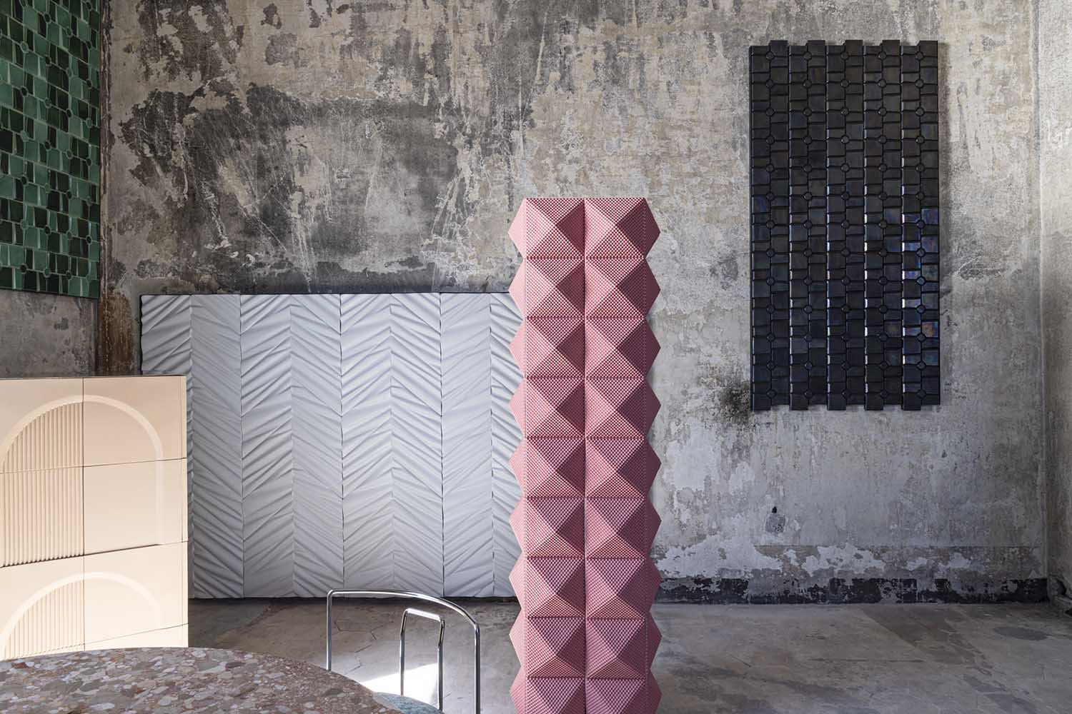
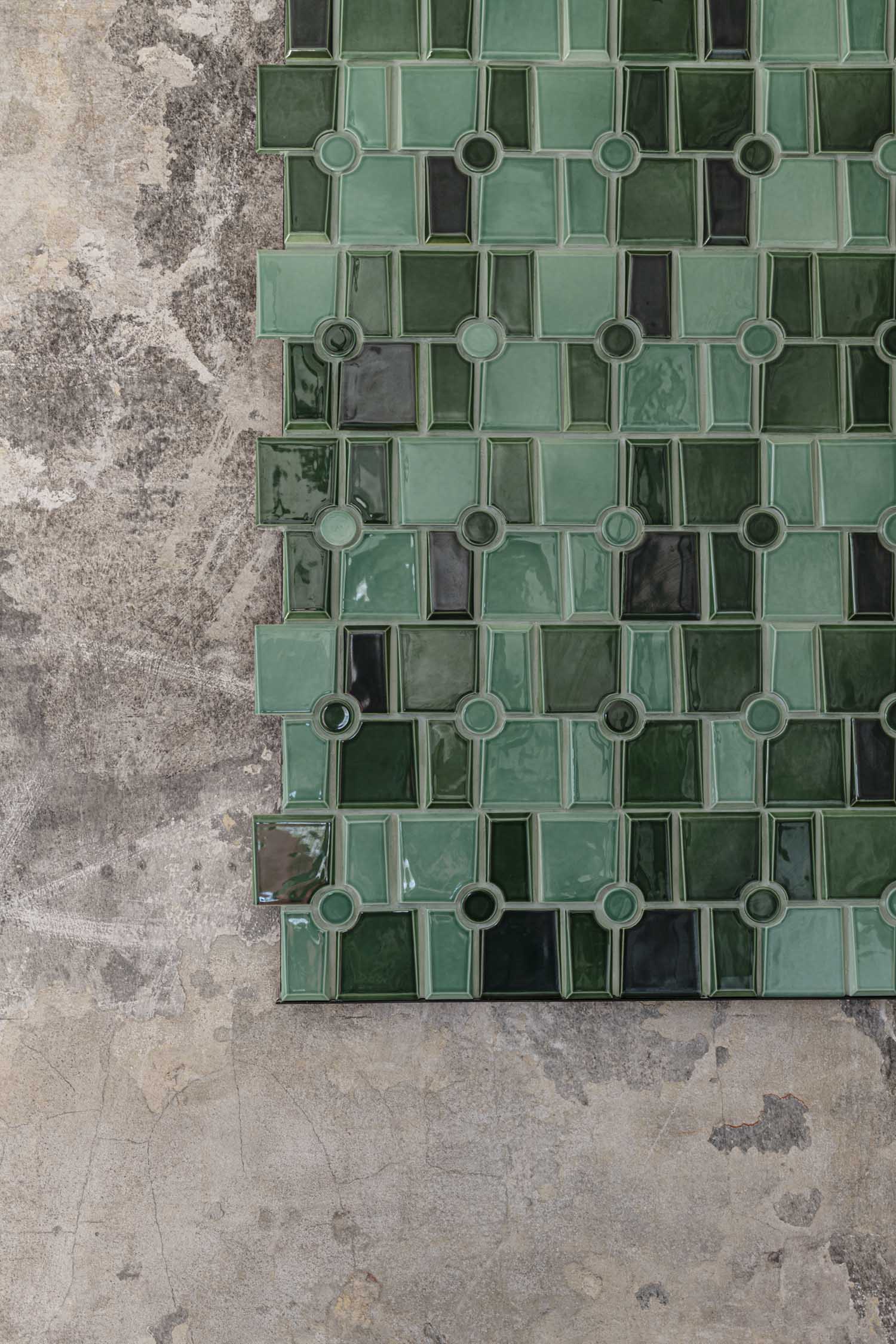
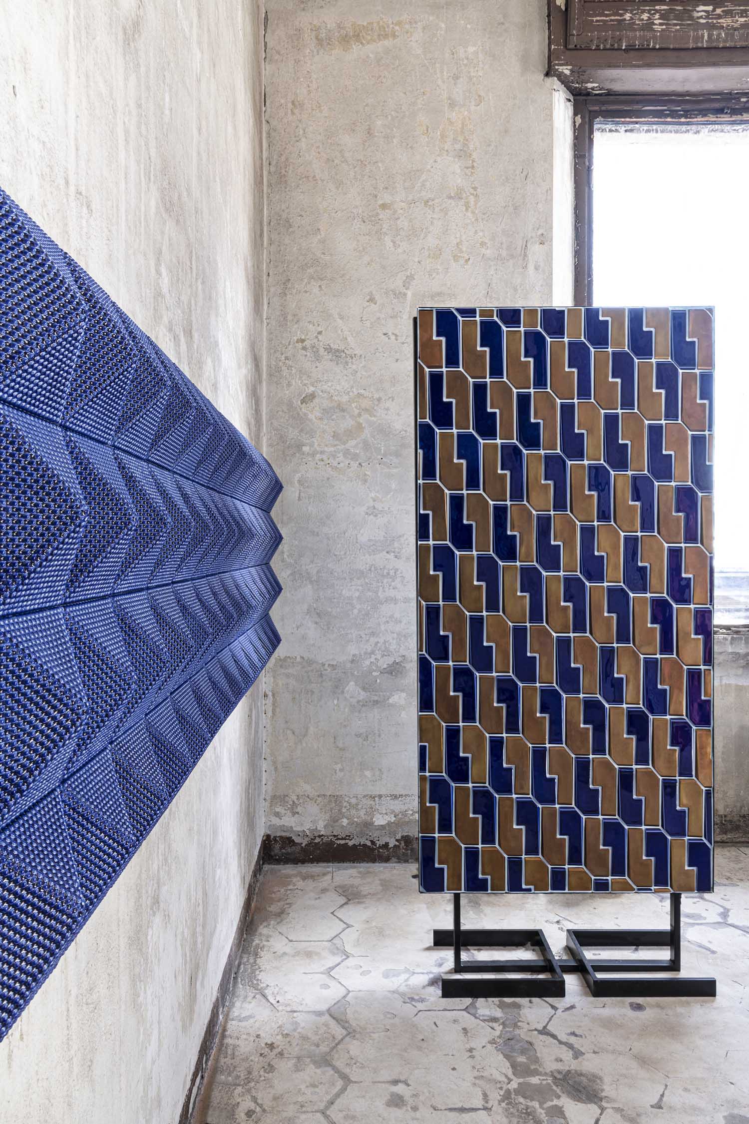
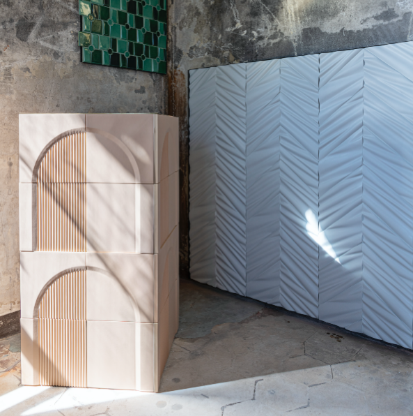
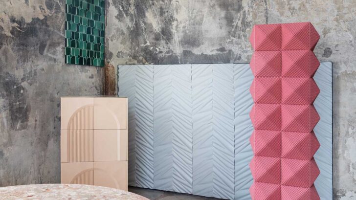
The porcelain surfaces in the collection are available in a variety of formats, including elegant mosaic compositions and large/medium modules that can cover expansive areas. This versatility allows for seamless integration into a wide range of architectural and design projects. Whether used as wall coverings, internal or external facades, or as accents for structural elements, the surfaces add a touch of sophistication and luxury to any space.
De Marchi Verona presented the new collection at Alcova 2023 in a surreal and enchanting setting that celebrated the opulence of porcelain. Within this ethereal setting, visitors were immersed in a sensory experience, surrounded by an exquisite array of three-dimensional surfaces boasting an extraordinary range of colors and textures.
In an insightful interview with Giacomo Totti, the acclaimed designer and art director of De Marchi Verona, we gain a glimpse into his unconventional approach to tile design, his considerations when selecting materials, and his thoughts on color and staying up-to-date with the latest trends.
How do you incorporate tiles into your interior design projects?
I do not like to follow specific rules or patterns. I am mostly interested in the dialogue and dissonances between the various elements that form a project. Tiles can be used canonically to cover a bathroom or a backsplash, but also to cover furniture or architectural backdrops. I personally love this material in relation to water and fire.
What factors do you consider when selecting tiles for a specific space?
Infinite factors. The assonance or color and material contrast of the material but surely also the form, which need not necessarily dialogue with the context, must be able to arouse a sense of wonder, of total immersion in the environment, even at a tactile level.
What are some popular tile patterns or designs that you often recommend to
clients?
None in particular. It depends on the project and the specific language used in it.
How do you ensure that the chosen tiles complement the overall theme or style of a
space?
I would like to answer: thanks to a certain level of sensitivity but it would come out as arrogant, it makes more sense the classic, “This is a professional secret.”
Are there any specific tile materials that you prefer working with? Why?
Porcelain, because it has the highest degree of luster and performance.
What are some key considerations when selecting tile colors to achieve a desired
mood or atmosphere?
I spend a lot of time on color in my work, and I think it is one of the most underrated and complex parts of it. In color generally it takes the highest degree of fussiness, a knowledge of how mixtures work, and above all a dialectic of light that varies with geographic location, light exposure, architecture, and a very wide range of secondary factors. A skillful use of color in relation to the desired atmosphere requires a large amount of time and an evaluation of sampling in different time frames. Clients often ignore the correct timing for color studies and often so do many of my colleagues.
How do you stay up-to-date with the latest tile trends, and how do you incorporate
them into your designs?
I spend almost all of my time shuttling between the internationality and the ferment of the design city par excellence: Milan and the sedimented artisan reality of the Veneto region, in this case the comune of Nove represents a historical artisan pole, in which illuminated realities have developed, thanks to the great tradition (in the world of ceramics) that has made possible its connection with great international architects, designers and artists.
What was the inspiration for the collection with De Marchi?
The inspiration for De Marchi was born, as often happens to me, starting with the material: porcelain. This snow-white earth that succeeds in having such a degree of purity and essence aroused in me a dreamlike suggestion that I would describe as almost metaphysical. It is difficult for me to describe in words a shape, a surface, its relationship with light and things, but this first emotion was predominant in the process of developing the De Marchi project.
How important was it to show at Alcova during the Design Week?
A lot, it was the test case. The emerging realities within the design week, the most felt and followed in the world in our sector I dare say. We are extremely satisfied with the feedback, the great interest and above all the warmth that the public has reserved for us. We are looking forward to being back at this incredible event, a summit among many cultures from all over the world.
Discover more on www.demarchi.com